Figure Skating Medal Distribution
Medals! Who Wants One?
So, I was talking some figure skating with a co-worker as you do and since I know little about the sport I asked if there was an optimal age for a figure skater. I was told that 20 is the golden age. That stuck in my head and I wondered if anyone had looked at this. Likely someone has however a very cursory Google search produced no results while also helpfully leading me to a Wikipedia page with the exact tables that I would need to look at this myself.
So, is 20 the golden age?
First, let’s get the table and extract the age for male figure skaters:
## medals by age

library(tidyverse)
library(rvest)
##
## Attaching package: 'rvest'## The following object is masked from 'package:purrr':
##
## pluck## The following object is masked from 'package:readr':
##
## guess_encodinglibrary(lubridate)##
## Attaching package: 'lubridate'## The following objects are masked from 'package:data.table':
##
## hour, isoweek, mday, minute, month, quarter, second, wday,
## week, yday, year## The following object is masked from 'package:igraph':
##
## %--%## The following object is masked from 'package:base':
##
## datelibrary(ggthemes)
url <- "https://en.wikipedia.org/wiki/List_of_Olympic_medalists_in_figure_skating_by_age"
# read in table for men's
mens_age <- url %>%
read_html() %>%
html_node(xpath = '//*[@id="mw-content-text"]/div/table[2]') %>%
html_table(fill = TRUE)
# extract age
mens_years <- str_extract(mens_age$Age, '\\d+(?=\\s+years)')Let’s see what the distribution looks like for Men’s Figure Skating:
#ggplot
mens_age %>%
  mutate(mens_years = str_extract(Age, '\\d+(?=\\s+years)')) %>%
  mutate(Medal = fct_relevel(as.factor(Medal), "Gold","Silver","Bronze")) %>%
  ggplot(aes(mens_years)) +
  geom_bar(stat = "count", aes(fill = Medal)) +
  scale_fill_manual(values = c("#F0E442","#999999","#D55E00")) +
  theme(panel.background = element_blank(), panel.grid.major.y = element_line(color = "light grey", size = 0.25)) +
  labs(x = "Age", y = NULL, title = "Men's Figure Skating Medal Distribution", subtitle = "By Age - Split by Type")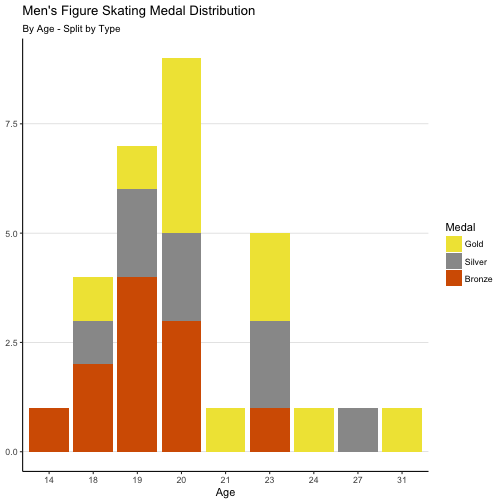
So far 20 is looking pretty good for the Golden Age.
Now, let’s get the table for female figure skaters:
# read in table for women's
womens_age <- url %>%
  read_html() %>%
  html_node(xpath = '//*[@id="mw-content-text"]/div/table[3]') %>%
  html_table(fill = TRUE)

# extract age
womens_years <- str_extract(womens_age$Age, '\\d+(?=\\s+years)')
And we plot this out in the same way:
#ggplot
womens_age %>%
  mutate(womens_years = str_extract(Age, '\\d+(?=\\s+years)')) %>%
  mutate(Medal = fct_relevel(as.factor(Medal), "Gold","Silver","Bronze")) %>%
  ggplot(aes(womens_years)) +
  geom_bar(stat = "count", aes(fill = Medal)) +
  scale_fill_manual(values = c("#F0E442","#999999","#D55E00")) +
  theme(panel.background = element_blank(), panel.grid.major.y = element_line(color = "light grey", size = 0.25)) +
  labs(x = "Age", y = NULL, title = "Women's Figure Skating Medal Distribution", subtitle = "By Age - Split by Type")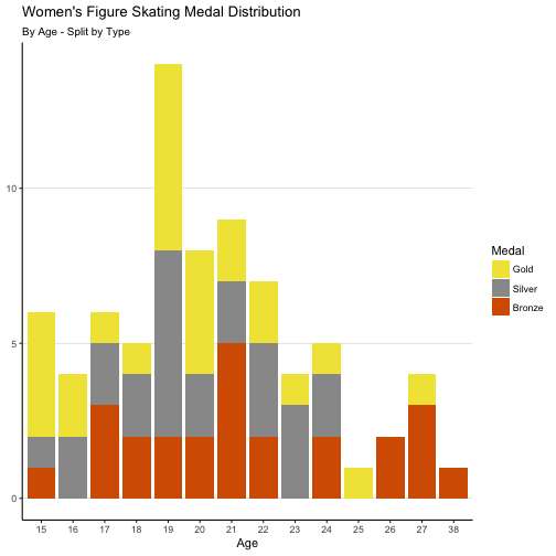
19 has the edge on 20 for the Women’s Figure Skating dataset but 20 turns out to be a great guess borne out by data.
So, that’s settled but as I looked at the data I had one more question. I wonder if birth month matters. I was looking for some presence of the Relative Age Effect which I thought would be present given that these athletes must get started at a very young age.
So, let’s start by looking at the birth months for the male figure skating medalists:
# extract unique birthdays
mens_dobs <- mens_age %>%
  group_by(Name, `Date of Birth`) %>%
  filter(row_number(Rank) == 1) %>%
  mutate(month_number = month(mdy(`Date of Birth`)))

# qplot
# qplot(as.factor(dobs$month_number))

# ggplot
mens_dobs %>%
  ungroup() %>%
  mutate(month_numberf = as.factor(month_number)) %>%
  mutate(Medal = fct_relevel(as.factor(Medal), "Gold","Silver","Bronze")) %>%
  ggplot(aes(fct_reorder(month_numberf, month_number))) +
  geom_bar(stat = "count", aes(fill = Medal)) +
  scale_fill_manual(values = c("#F0E442","#999999","#D55E00")) +
  theme(panel.background = element_blank(), panel.grid.major.y = element_line(color = "light grey", size = 0.25)) +
  labs(x = "Birth Month", y = NULL, title = "Men's Figure Skating Medal Distribution", subtitle = "By Birth Month - Split by Type")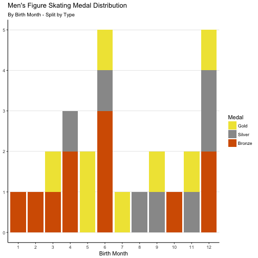
No extremely distinctive pattern. Are there possibly two age cut-off dates? One for June 1 and one for Dec 1?
Let’s take a look at the distribution for female figure skating medalists:
Before we look at the exact same plot let me just tease this out a bit and let you experience this in the order that I did. So, first we just look at distribution for medal winners without splitting by type:
# extract unique birthdays
womens_dobs <- womens_age %>%
  group_by(Name, `Date of Birth`) %>%
  filter(row_number(Rank) == 1) %>%
  mutate(month_number = month(mdy(`Date of Birth`)))

# ggplot
womens_dobs %>%
  ungroup() %>%
  mutate(month_numberf = as.factor(month_number)) %>%
  #mutate(Medal = fct_relevel(as.factor(Medal), "Gold","Silver","Bronze")) %>%
  ggplot(aes(fct_reorder(month_numberf, month_number))) +
  geom_bar(stat = "count") +
  #scale_fill_manual(values = c("#F0E442","#999999","#D55E00")) +
  theme(panel.background = element_blank(), panel.grid.major.y = element_line(color = "light grey", size = 0.25)) +
  labs(x = "Birth Month", y = NULL, title = "Women's Figure Skating Medal Distribution", subtitle = "By Birth Month - Split by Type")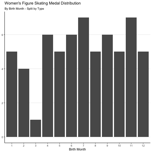
Other than March seeming to be an exceptionally bad month to be born if you want to medal there is almost no pattern at all. Alright, let’s drop the fill:
# ggplot
womens_dobs %>%
  ungroup() %>%
  mutate(month_numberf = as.factor(month_number)) %>%
  mutate(Medal = fct_relevel(as.factor(Medal), "Gold","Silver","Bronze")) %>%
  ggplot(aes(fct_reorder(month_numberf, month_number))) +
  geom_bar(stat = "count", aes(fill = Medal)) +
  scale_fill_manual(values = c("#F0E442","#999999","#D55E00")) +
  theme(panel.background = element_blank(), panel.grid.major.y = element_line(color = "light grey", size = 0.25)) +
  labs(x = "Birth Month", y = NULL, title = "Women's Figure Skating Medal Distribution", subtitle = "By Birth Month - Split by Type")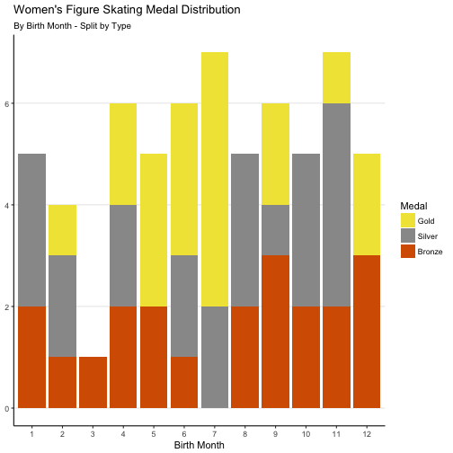
Looking back at the Men’s plot and then at this one we can see that 50% of male gold medalists and 55% of female gold medalists were born in May, June or July.
So, if you want to win a gold medal hopefully you were born in the summer.
After seeing this, I expected to discover that most competitions have May 1 age cut-offs. However, from just looking into it quickly it seems that most cut-off dates are actually September 1. Which means these gold medalists were considerably younger than other skaters in their age class when they first started training and competing. Could it possibly be that being younger and smaller is an advantage in figure skating when kids first start training? Of course, I only saw this Sept 1 reference in documents from U.S. Skating so maybe other countries do have different cut-off dates.