Giving By Major
Looking at Giving Trends by Major
To perform this analysis, you will need a csv file with the unique IDs for your alumni as well as their majors and if they are a donor or not as a binary variable (1 or 0). You can also add in any other variables that you want to include.
First, load the ggplot2 library (use install.packages(“ggplot2”) if you don’t have this package yet. We will use this for plotting. Also, set the working directory to the folder where this csv file is located:
library(ggplot2)
library(RCurl)
Then, read the file into R:
x <- getURL("https://raw.githubusercontent.com/michaelpawlus/giving_by_major_comparison/master/alum_donor_factors_no_names.csv")
ad <- read.csv(text = x, stringsAsFactors = FALSE)
Use the summary function to look for any outliers:
summary(ad) ## summary of the data## coreid aff_total coresex coreprefyr
## Min. : 1923 Min. : 0.00 Length:2878 Min. :1967
## 1st Qu.:102878 1st Qu.: 4.00 Class :character 1st Qu.:1986
## Median :129104 Median : 7.00 Mode :character Median :2000
## Mean :310682 Mean : 10.17 Mean :1997
## 3rd Qu.:597856 3rd Qu.: 11.00 3rd Qu.:2009
## Max. :727273 Max. :248.00 Max. :2014
## Degree Major fy14 donor
## Length:2878 Length:2878 Min. : 0.27 Min. :1
## Class :character Class :character 1st Qu.: 25.00 1st Qu.:1
## Mode :character Mode :character Median : 50.00 Median :1
## Mean : 351.06 Mean :1
## 3rd Qu.: 200.00 3rd Qu.:1
## Max. :51245.54 Max. :1I want to use affinity score or engagement score for my x-axis to see the impact of affinity on giving so I am going to trim my dataset so that I don’t get heavily skewed results from outliers and also to improve readability.
ad2 <- ad[ad$aff_total<16,]Next, let’s create a table of all the majors in the dataset to see which ones have the most representations and then pull a top ten list.
maj_tbl <- aggregate(coreid ~ Major, data = ad2, length)
head(maj_tbl[order(-maj_tbl$coreid),], n= 10)
## Major coreid
## 2 Accounting 129
## 47 General Education 116
## 18 Business General 109
## 92 Nursing 94
## 105 Psychology 92
## 84 Management 89
## 45 Finance 88
## 85 Marketing 85
## 106 Public Administration 85
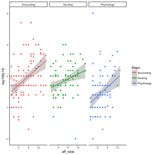
## 100 Physical Education 83From this table, pull a few majors to compare. I will select three.
ad4 <- ad2[ad2$Major %in% c("Accounting","Nursing","Psychology"),]Then, use a faceted plot to compare giving between majors as well as the relative impact of engagement.
qplot(aff_total, log10(fy14), data = ad4, color = Major, facets=~Major) + stat_smooth(method="lm")